Logo Guideline
Uploading the Brand Resources
Using our bitwallet Logo
Before using our bitwallet logo, please be sure to follow the basic guidelines below.
Guideline
bitwallet Logo

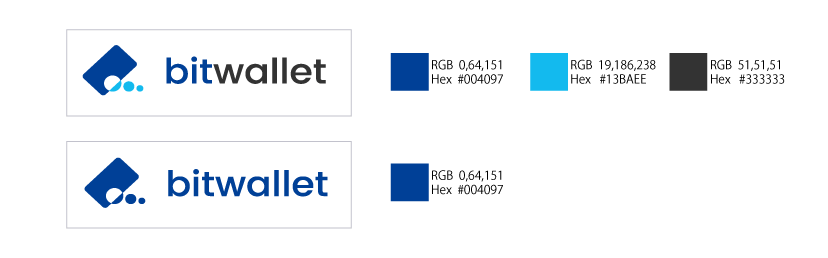
Identity Color
Our new logo is compromised by different shades of blue as it symbolises trust and reliability between users and our services. Should you be using our logo for any publication purposes, it is preferred to use only the coloured logo meanwhile ensuring the image is at its highest clarity and quality.
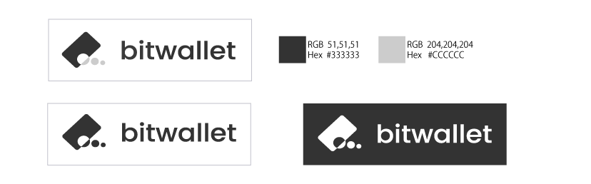
A greyscale version is readily available for print and onscreen display should the need arises. You may use the black and white logo for single color design.
Clear Space
We have defined specific parameters for our logo clear space. No graphic elements should be within the clear space. All other graphics elements should be given as much space as possible even when they are out of the clear space.

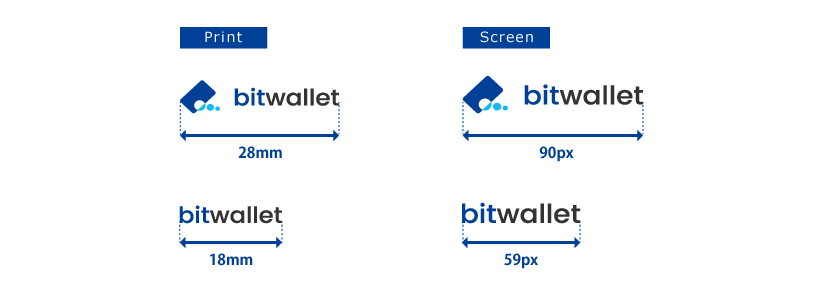
Minimum Size
Ensure length is above 28mm for print and above 90px onscreen. For smaller logo, please use our logotype with its length at 18mm or above for print and 59px onscreen.
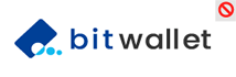
Misuse
Treat our logo right. Let’s keep it neat with the best practices mentioned below.

Do not scale logo disappropriately
Do not alter font settings such as size and kerning

Do not hinder logo visibility

Do not rotate the logo

Do not add effects to the logo such as shadow

Do not alter color of the logo

Do not hide part of the logo

Do not typeset the logo

Do not apply gradiention to logo
Logomark (Used Alone)
Logomark and logotype should always be used a combination logo. However, it will be allowed to be used them alone as an icon design (formatted graphics). The logo size can go beyond our minimum size to match the icon size.

Logomark (Used Alone)
Logomark and logotype should always be used a combination logo. However, it will be allowed to be used them alone as an icon design (formatted graphics). The logo size can go beyond our minimum size to match the icon size.